
Nametag Design Tips That Make Badges Genuinely Useful
A good event badge does real work — helping people connect. Here is how to design nametags that are readable, useful, and worth printing.
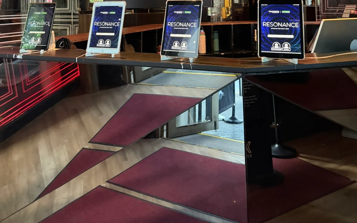
Event badges are easy to treat as an afterthought — a name on a card, clipped on and forgotten. But a well-designed badge does real work at an event. It helps strangers introduce themselves, lets staff greet guests warmly, and makes networking less awkward. A poorly designed one does none of that, and the difference comes down to a few design choices.
Here is how to design nametags that are genuinely useful.
Make the Name the Star
The single most important job of a badge is to let one person read another's name from a comfortable, respectful distance — without leaning in or squinting. That means the name must be big. Really big.
Prioritize the first name in large, bold type — large enough to read from across a handshake. Everything else on the badge is secondary and should be visually smaller. The most common badge design mistake is a small name crowded by logos, titles, and decoration. Flip that hierarchy: name first, everything else after.
Keep Secondary Information Secondary
Company, role, or other details have their place, but below the name and noticeably smaller. A good rule: if you stood two steps back, you should still read the name clearly, with the other details legible only up close. That is exactly the hierarchy you want, because the name is what matters at conversational distance.
Resist the urge to pack everything on. A badge crammed with information reads as clutter, and the one thing people actually need — the name — gets lost.
Use Visual Cues for Categories
At many events, it helps to tell groups apart at a glance: speakers, VIPs, staff, sponsors, general attendees. A simple visual cue does this elegantly — a color band, a symbol, or a colored border that distinguishes each category.
This lets people identify roles instantly. An attendee can spot a staff member who can help; a sponsor can recognize a speaker worth meeting. The cue should be simple and consistent, not a rainbow of hard-to-remember codes.
Design for the Format
Badges come in different formats — clip-on, lanyard, adhesive — and the design should suit the one you are using. Lanyard badges hang lower, so the name needs to sit high enough to read when worn. Adhesive badges are smaller, so ruthless prioritization of the name matters even more. Match your design to how the badge will actually be worn.
Leave Room for Legibility
White space is your friend. A badge with generous margins and clear separation between the name and other details reads far better than a dense one. Do not fill every millimeter; let the name breathe. Legibility beats decoration every time.
Print Them Fresh, On Demand
Even the best badge design is undermined by the old approach of pre-printing hundreds of badges the night before. Misspellings cannot be fixed, walk-ins have no badge, and staff waste time hunting through an alphabetized pile.
On-demand printing solves all of this. Paired with digital check-in, each badge prints the moment a guest arrives — correctly spelled, freshly made, no pre-sorting. Walk-ins and last-minute changes are handled instantly. Your careful design reaches every guest exactly as intended.
Test Before the Event
Print a few sample badges before the day and look at them the way a guest would. Can you read the name from a step back? Are the categories distinguishable? Does anything feel cramped? A five-minute test catches design problems that are trivial to fix beforehand and impossible to fix mid-event.
Choose Colors and Contrast Carefully
Color does a lot of quiet work on a badge, and getting it right improves both legibility and usefulness. The name must sit in high contrast against its background — dark text on a light field, or the reverse — so it reads instantly from a comfortable distance. Low-contrast combinations, however stylish, defeat the badge's core purpose. Before committing, view a printed sample from a step or two back; if the name is not immediately readable, raise the contrast.
Color is also the most elegant way to signal categories. A colored band, dot, or border that distinguishes speakers, VIPs, staff, and general attendees lets people identify roles at a glance without cluttering the badge with text. Keep the scheme simple — a handful of clearly different colors, not a rainbow no one can remember — and consistent, so the same color always means the same thing. A small legend on your signage can help guests decode the colors if the scheme is not self-evident.
Mind your brand while you are at it. The badge is a wearable piece of your event's identity, so its colors should sit comfortably within your palette rather than clashing with it. But never let brand aesthetics override legibility: if your brand colors produce low contrast for the name, keep the name high-contrast and express the brand in the accents and category cues instead. The name always wins. Handled thoughtfully, color makes a badge more readable, more useful for spotting roles, and more on-brand all at once — a lot of value from a choice that costs nothing extra to get right. Test your color choices on a real printed badge, not just on screen, since colors can look different in print than they do on a monitor.
Above all, remember what the badge is for: helping people at your event connect. Every design choice — the size of the name, the contrast, the color cues, the printing method — serves that single purpose. When a guest can read another's name easily and tell their role at a glance, the badge is doing its job, and your event is a little warmer and easier to navigate for it. Keep that purpose in mind and the design choices largely make themselves.
Small Card, Real Impact
A nametag is a small thing that shapes how comfortably people connect at your event. Make the name big and bold, keep secondary details in their place, use simple cues for categories, and print fresh on demand. Get it right and your badges quietly do their job — helping a room full of strangers become a network.
If you are planning an event in Metro Manila, we provide badge printers and iPads set up for on-demand printing, and we are happy to help you design badges that actually work. Delivered and configured by our team.
Planning an event?
We deliver and set up iPads, printers, and registration tech across Metro Manila.
Request a quote