
Making Self-Service Check-In Truly Self-Explanatory
A self-service kiosk only saves staff if guests can use it without help. Here is how to design one that explains itself.
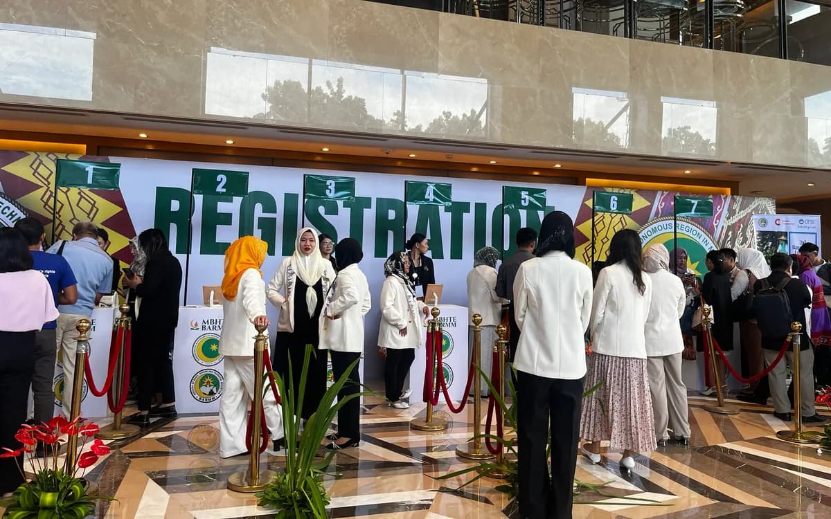
Self-service check-in promises a real benefit: guests register themselves while your staff focus on hospitality and exceptions. But that benefit only materializes if guests can actually use the kiosk without help. A confusing self-service setup does the opposite of what it is meant to — it creates a queue of puzzled guests and pulls staff over to assist, defeating the entire purpose. The key is designing a kiosk that explains itself. Here is how.
Design for a Guest Who Has Never Seen It
The fundamental principle is to design for a first-time user with no instructions. Your guests have never seen your kiosk before and will not read a manual. Every step must be obvious enough that a person walking up understands what to do immediately. If using the kiosk requires any explanation, it is not yet self-explanatory. Test your design against this standard ruthlessly: could a stranger use it, unaided, on their first try?
Minimize the Steps
Every step is a chance for a guest to hesitate, get confused, or give up. The fewer steps to check in, the more self-explanatory the kiosk. Strip the process to its essentials: find the guest, confirm, done. Remove anything that is not truly necessary at the kiosk. A two-step check-in is far more self-explanatory than a five-step one. Ruthless simplicity is the single biggest factor in whether guests can self-serve successfully.
Make the First Action Obvious
Guests need to know what to do the moment they approach. The starting action — tap here, scan your code, enter your name — should be unmistakable, prominent, and inviting. A kiosk that presents an ambiguous screen leaves guests unsure where to begin. A clear, single, obvious first action draws them in and starts the flow confidently. Do not make guests guess how to start.
Use Clear, Plain Language
The words on the kiosk matter enormously. Use plain, direct language that tells guests exactly what to do — "Enter your last name," "Tap to check in," "Take your badge below." Avoid jargon, cleverness, or ambiguity. Each screen should communicate its one action clearly. Clear instructions are the difference between a guest proceeding confidently and one standing puzzled. Write for the least tech-comfortable guest you expect.
Guide the Whole Flow
A self-explanatory kiosk guides the guest through the entire flow, each step leading naturally to the next, with the guest always knowing where they are and what happens next. Do not leave guests wondering whether they are done, or where their badge is, or what to do after checking in. Clear prompts at each stage — including a clear completion and a clear direction to collect a badge and proceed — carry the guest smoothly from start to finish.
Make the Badge Collection Obvious
If a badge prints, guests need to know where to get it. A common self-service failure is a guest who checks in successfully, then stands confused because they do not know a badge is printing or where. Make it unmistakable: a clear on-screen prompt directing them to the badge, and a clearly labeled, logically placed printer right where they expect it. Close the loop so the guest leaves with their badge, not confusion.
Position and Height Matter
Physical design is part of being self-explanatory. Mount the kiosk at a comfortable, accessible height so guests of all sizes and abilities can use it naturally. Position it where guests naturally arrive and have room to interact. A kiosk that is awkward to reach or oddly placed creates hesitation before the guest even starts. Good physical placement invites confident use.
Keep a Human Nearby, and Test With Real People
Even a well-designed kiosk benefits from a staff member nearby to help the occasional guest who gets stuck — one person can oversee a whole bank of kiosks. And the surest way to know if your kiosk is self-explanatory is to test it with real people who have never seen it. Watch where they hesitate, and fix those moments. Real-user testing reveals confusion that designers, who know the system, cannot see.
Iterate on the Kiosk Over Events
A self-explanatory kiosk is rarely perfect on the first try; it gets there through iteration across events. Each time you run self-service, watch how real guests interact with it and note where they hesitate, get confused, or need help. Those friction points are your improvement list. Refine the kiosk before the next event — clearer wording here, a repositioned element there, a removed step — and each iteration makes it more genuinely self-explanatory. Over several events, this steady refinement produces a kiosk experience that most guests breeze through unaided.
Pay attention to where staff actually get called over to help, since that is the clearest signal of a kiosk that is not yet self-explanatory. If guests consistently need assistance at a particular step, that step needs redesigning. The goal is to drive the need for help toward zero — not because help should be unavailable, but because a kiosk that rarely needs it is delivering its full benefit of freeing staff. Track where help is needed, fix those points, and watch the need diminish event over event.
Gather input from the staff overseeing the kiosks, too. They see every guest interaction and know exactly where people stumble. Their observations are a rich source of improvements you might not spot yourself. After each event, a quick conversation with the staff about what confused guests surfaces concrete, actionable refinements. This combination of watching real guests and listening to your staff turns each event into a lesson that improves the next. A self-service kiosk is not a set-and-forget deployment but a design that gets better the more you learn about how your specific guests use it. Iterate on it deliberately over events, and you develop a self-service experience so smooth and self-explanatory that it delivers exactly what self-service promises — guests checking themselves in effortlessly, and your staff freed for the hospitality and exceptions where they add the most value.
Self-Explanatory Is the Whole Game
A self-service kiosk only delivers its benefit if guests can use it unaided, and that depends entirely on how self-explanatory it is. Design for a first-time user, minimize the steps, make the first action and the badge collection obvious, use plain language, guide the whole flow, get the physical placement right, and test with real people. Get this right and self-service genuinely frees your staff; get it wrong and it creates the very problem it was meant to solve.
If you are planning self-service check-in for an event in Metro Manila, we can set up genuinely self-explanatory kiosks — iPads on accessible stands with on-demand badge printing, configured for a smooth, unaided flow. Delivered and set up by our team.
Planning an event?
We deliver and set up iPads, printers, and registration tech across Metro Manila.
Request a quote